Monday, 27 September 2010

Indie Genre Album Covers


Florence & the Machine - Lungs
  • Florence is wearing a pair of lungs which could symbolise that her music is a new breath of fresh air. Also, the lungs are an internal organ, and the fact that she is wearing them outside can give off connotations that she is baring her soul and her life into this music.

  • Even though Florence is in the centre of the album cover, she doesn't seem to be selling the album cover by her image and who she is. Her face seems to have very fair make-up on but her face is covered mostly by her hair and her side on pose. Covering her face is like concealing her identity, which links to her music is more important than her image which is a convention of Indie Music.

  • Her side-on face and the open-armed pose shoes that she is opening herself to her listeners and that she has nothing to hide. She is confident for who she is and the music that she produces; it's not all about her but her music.

  • The backdrop behind her is of greenary and flowers which has the obvious connotations of nature. Her costume colour blends in the backdrop, again camoflaging her to the album cover.

Coldplay - Viva La Vida

  • The name of the actual album is called "Viva La Vida" which is Spanish for "Live the Life". This Album Title has a moral behind it to live the life to the full. This follows the genres conventions as Indie songs usually containing a deeper meaning that just a literal one.

  • The actual font style is like it has been graffittied by someone in paint  really quickly as if to make a sudden point. The fact that it is painted on, it goes with the painting background. It is in the centre of the painting behind it and this puts it in the centre of attention of the actual album cover; ready to make its point of "Live the Life". Indie music is all about the lyrics and titles carrying a meaning within them rather than just putting music to it and making it sound catchy.

  • The background image of the actual album cover is of a famous painting by Eugene Delacroix called "Liberty Leading the People". Again this painting has a political meaning as it personifies freedom as the lady is leading the French to happy freedom. This could suggest that these songs in the album are about having the right of freedom to "Live the Life".

  • The name of the artists of this album cover are not printed on the album cover. This could suggest that Coldplay are selling their music by the deeper level of meaning in the lyrics and songs rather than their image, fame and who they are. This follows the convention of Indie music being all about the music and not much about the artists themselves.

Monday, 20 September 2010

Definitions of Key Terminology

GENRE
A type of media text that follows a similar set of rules or conventions.

GENERIC CONVENTIONS
A set of unwritten rules or ingredients that make up a genre.

TARGET AUDIENCE
A specific group of people that a media text is designed for.

DENOTATION
The features, signs, imges or noticeable elements that make up a whole text.

CONNOTATION
The implied meanings associated with certain specific features of a text.

MISE EN SCENE
The way objects are positioned within a text or the overall composition.

ICONOGRAPHY
These are symbols, pictures and objects that represent other ideas, feelings and beliefs.

GENRE SIGNIFIERS
These are signs and symbols that represent a deeper meaning or connotation of something else. In this case, how a particular kind of dance shows that the song has a particular genre.

INSTITUTIONAL CONTEXT
This is the important value or quality that is highly consisted and is the typical feature of particular topics or genre.

POTENTIAL/TARGET AUDIENCE
These are the people who would typically purchase a particular product; a group of people who would normally be interested in that sort of music or genre.

ANCHORAGE
This is when two aspects work together to explain the message of the song.

HIGH KEY LIGHTING
Used to create a bright and colourful atmosphere that can be used to create a certain tone.

LOW KEY LIGHTING
Used to create dark settings and atmosphere in a text.

JUXTAPOSITION
When two different or constrasting elements are brought together in one text; side by side.

REPRESENTATION
The way someone or something is represented in a text.

MOTIF
An object, a style or a theme associated with a group of texts.

IDEOLOGY
A set of ideas that underpin the production od a media text.

Friday, 17 September 2010

Music Genres, Examples & Target Audiences

Pop
Conventions
  • Pop songs have a repeated beat sound to it. Normally it isn't very loud and sharp but just the basis of the song.
  • Pop songs are normally about Love but they can differ depending on the artist.
Target Audience
The Pop genre can be so broad that there is no specific group of people who would prefer this type of music. Although because Pop music is normally broadcasted more than any other genre, I feel that this genre has many listeners; mainly young because it is more of a modern type of music.
Examples of Pop Artists

  • Shakira

  • Britney Spears

  • Cheryl Cole

  • The Saturdays

  • Jedward
Rock

Conventions

  • Rock songs are heavily inspired by guitars and usually involve some sort of live-played instrument.

  • Rock songs often involve a repeated chorus all throughout the song with only 3 or 4 verses.
Target Audience
This genre is more deep, very loud and synical. Because of this I feel that the ultimate target audience are the steretypical goths. These are people who maybe appreciate the heavy guitar playing rather than lyrics because there are very few lyrics.
Examples of Rock Artists

  • Slipknot

  • Bon Jovi

  • Marylin Manson

  • Evanescence

  • Nickelback
Indie

Conventions

  • Indie songs have similar song structures of Rock songs. However, Indie songs have a cheaper and a more experimental feel because it uses less technical equipment than any other genre.

  • Indie songs are usually about reality and more political issues as the indie fans appreciate indie music for their lyrics rather than how catchy the song is.
Target Audience
Because Indie songs are less instrument based and more lyrical based, I think the target audience for this genre would be the type of people who look to the main meaning of the song rather than the beat of the song. It can be said that this target audience could mainly consist of young adults because as Indie music is less exposed in the media than Pop music, there may be a lot more research needed to find particular Indie bands and what's the latest news about them.
Examples of Indie Artists

  • The Kooks

  • The Kaiser Chiefs

  • Kate Nash

  • Ellie Goulding

  • Eliza Dolittle
Rap/Hip-Hop

Conventions

  • Rap/Hip-Hop songs have a broad subject area as they can be about anything and everything; about love or about hate.

  • Rapping is more about chanting rhymed lyrics really fast rather than singing them.

  • Sometimes Rap/Hip-Hop involve sampling which is where Rap/Hip-Hop Artists take an old song and put their own spin to it. E.g. Kanye West - Diamonds from Sierra Leone.
Target Audience

Examples of Rap/Hip-Hop Artists

  • Kanye West

  • Eminem

  • Jay-Z

  • Lil Wayne

  • 50 Cent
Dance

Conventions

  • Dance Songs are normally upbeat and positive as they want to make people dance and feel happy about themselves when on a night out.

  • most Dance songs consist of a repetitive beat with either very few lyrics or very simple lyrics that are catchy to remember.
Target Audience

Examples of Dance Artists

  • Lady Gaga

  • Cascada

  • Bass Hunter

  • Scissor Sisters

  • David Guetta
Folk

Conventions

  • Folk songs usually have traditional instruments in them such as mandolins, violins and acoustic guitars.

  • Some folk songs are played as a band but usually folk songs are played by one person on their own.

  • Folk songs normally have a narrative within the lyrics and tell a story or a perception about a particular issue.
Target Audience

Examples of Folk Artists

  • Bob Dylan

R'n'B

Conventions

Target Audience

Example of R'n'B Artists

  • Beyonce

  • Neyo

  • Rihanna

  • Mary J. Blige

  • Usher

Thursday, 16 September 2010

Connotations of CD Covers

Beyonce - Sweet Dreams
June 2nd 2009

Pose and Face Expression

  • Beyonce's Pose alone is very animalistic and ferrel. She is crouching down and taking up the whole space of the CD Cover. It is almost like she is a trapped wild animal.

  • Beyonce's Face expression is very confrontational and aggressive as she seems to be wanting to start a fight.
Anchorage

  • The colours used in the CD Cover emphasises a dark atmosphere, whereas the title suggests a more warm atmosphere of "Sweet Dreams". The blackness of the CD Cover carries connotations of having a nightmare and this juxstaposes against the connotations of "Sweet Dreams", where this would normally be said to a child before bed time.
Font Style

  • The font style of the tite of the CD "Sweet Dreams" almost suggests luxury with the colour of the font being gold. And from afar the font almost looks like someone has hand written it in a nice handwriting style, however when analysed closer it is clear to see that the edges of the words are jagged and almost knife life. This portrays the darker and sinister meaning behind the words "Sweet Dreams".
Lighting

  • The lighting is very limited and doesn't allow the viewer to see much of what is happening around Beyonce. Also not all of Beyonce's body is visible as some are darkened by shadows. This reinforces the connotation of this being a nightmare.
Costume

  • Beyonce's Costume is very limited as her legs and arms arre on full show. However, her costume of what seems to be black leather re-illiterates the rebel side of Beyonce and illustrating that she doesn't abide by society's rules.
Cheryl Cole - 3 Words
23rd October 2009

Colour Scheme

  • The colour scheme for Cheryl Cole's Album Cover is of greys, whites and blacks. This colours combined carry the suggests of something vintage. However, it is also fair to say that the soft grey and white could be illustrating Cheryl's innocence in the CD Cover.

  • The air of "vintage-ness" is also emphasised by the background of the CD Cover as it is like a Victorian painting as you can see the detailed brush strokes in the background.
Lighting

  • Cheryl Cole looks flawless her image on the CD cover. This can be due to the front lighting on Cheryl. This can mean that Cheryl is seen as part of a painting and suggests Cheryl's oil painting beauty as she is the main concentration of the painting.
Costume

  • The Victorian atmosphere is not only given by the oil painting feel of the paint brush strokes in the background, but also through her headress that Cheryl is wearing. The flowers in her hat and the netting that conceals her face is from the Victorian fashion that would have been.

  • Cheryl Cole is also naked in this image but is concealed of her modesty as only the back of her shoulder is seen in a mid shot. Because she is naked, it puts her at a vulnerable position as there is nothing to cover and protext her, i.e. clothing.
Font Style

  • The font that the title of the album and the artist name is written in is almost like a tattoo on Cheryl's shoulder/back which can suggest the commitment that she has as a tattoo is for forever and can not be removed easily.

  • The font style of the title of the album and the artist is almost as if it is of the handwriting of an old Victorian with all the curves in the letters. It reminds me of when a famous painter signs their own work in a classical way. This reinforces the fact that the actual CD Cover and Cheryl are an oil painting of some kind.

Wednesday, 15 September 2010

Analysing the 5 Music Video's Budget Spent

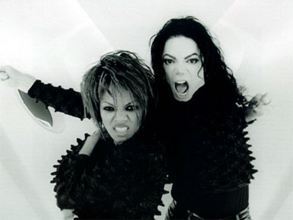
Michael Jackson feat Janet Jackson - Scream
$7 Million


• Janet Jackson’s Makeup ($88,000) alone compared to the Computerised Spaceship Set ($65,000) is too much spent on just her make up and more should of in theory be spent on the set; although the money for the Computerised Spaceship does seem reasonable if not cheaper than expected.

• Janet Jackson’s make up seemed to be very minimal with heavy black eye make up in particular, therefore for this reason I feel that the less money should have been spent on her make up.
• The Breaking of the Guitar by Michael Jackson ($53,000) is only featured in the music video for a mere couple of seconds and I feel that less money should be spent on this. Even though the guitars must have been expensive to buy and then break, fake guitars could have easily been made and to look realistic to be broken which would have been much cheaper.
• The Giant Video Screens ($80,000) could have been computer generated into the music video instead of getting real giant screens as it would have been much cheaper.


Mariah Carey ft Jay-Z - Heartbreaker

• The money that I feel is not spent well is the money that was paid for Mariah’s Hair Styling ($13,000). This is too much money jus for hair and the money should have been spent else where.
 
• Mansion Rental ($40,000) did they really need a mansion to portray the idea that Mariah is too high class for whoever broke her heart?


Busta Rhyme ft Janet Jackson - What's It Gonna Be

• Each Morph ($30,000) - too much because there were about 7 or more morphs and it seems like a waste of money. As this was new technology at the time of this music video, i understand that it would've have been expensive. However, in today's time it would have been much easier and cheaper to have.

• Janet and Busta’s Explosion ($20,000). Personally i don't think it was necessary to have this explosion in the music video as it doesnt really add to the sense of the music video.

Will Smith - Miami


• Each morph transition: $14,000 (and there were least 40 of these) This added up together would add up to a final total of $560,000 and this seems like an unbelievable price to pay for a simple effect.


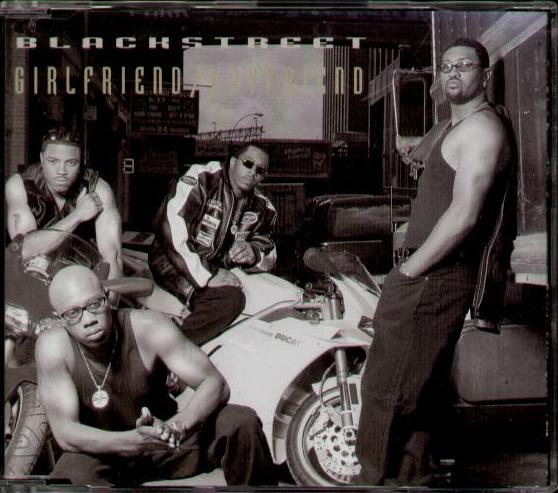
Blackstreet ft Janet Jackson - Girlfriend/Boyfriend
  • 3-D animation costs: $600,000 this is the most expensive amount of money that is spent on a specific part of this music video. However it can be reasonable due to it being part of new technology at the time, which means it would bound to be expensive.

Tuesday, 14 September 2010

Top 10 Most Expensive Music Video


1. "Scream"
Michael Jackson featuring Janet Jackson
$7 Million


2. "Victory"
Puff Daddy featuring Notorious B.I.G. & Busta Rhymes
$2.7 Million


3. "Heartbreaker"
Mariah Carey featuring Jay-Z
$2.5 Million


4. "What's it Gonna Be"
Busta Rhymes featuring Janet Jackson
$2.4 Million


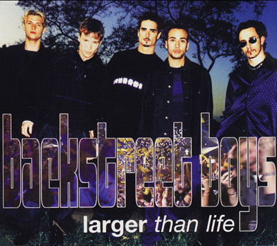
5. "Larger than Life"
Backstreet Boys
$2.1 Million


6. "Miami"
Will Smith
$2 Million


7. "She's a Bitch"
Missy Elliot
$2 Million


8. "Unpretty"
TLC
$1.6 Million

9. "November Rain"
Guns N' Roses
$1.5 Million


10. "Girlfriend/Boyfriend"
Blackstreet featuring Janet Jackson
$1.5 Million